Posted on

Flush-to-the-Wall Access Panels: How to Use Them in Interior Design.

Access panels: flush-to-the wall-access-panels

Access panels: flush-to-the wall-access-panels
Flush-to-the-wall access panels by Invisible-door.

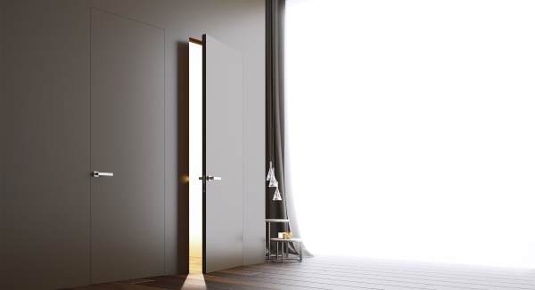
Invisible recesses and hidden compartments: the secret world behind flush-to-the-wall panels.

Discrete, roomy, conveniently invisible. Flush-to-the-wall access panels are a particularly useful and esthetically impeccable solution for home or office. The peculiarity of these fixtures is given by the panel and its closure. Without visible frame or trim, flush-to-the-wall panels are perfectly aligned with the wall once they are closed. This is why they are vastly appreciated when it is necessary to create invisible recesses or compartments. Or when you prefer not to break the uniformity of the wall with superfluous or ungainly elements. Here are some of the most common uses of flush-to-the-wall panels and the best options for structure and design.

Flush-to-the-wall recesses, hatches, and compartments: invisible nooks and space-saving design.

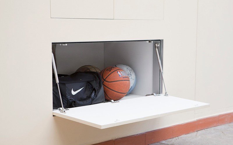
The typical invisibility of flush-to-the-wall panels is perfect for creating hidden compartments. For example to conceal safes and valuable objects. But also to cover meters, electrical panels, or protect cupboards and bookshelves. In these cases the flush-to-the-wall closure is providential. If the door is painted the same color as the wall, the concealment is nearly perfect. More so if, instead of fitting it with a handle, we resort to a push to open system. If instead you want to play with contrast and decoration, the clean, uniform surface is versatile and undemanding. Color oppositions, particular textures, and wallpaper offer ideas for unique combinations. An element that combines design and convenience for modern and functional furnishing.

Invisible-door Panels: measures and versions for plasterboard or brickwork.

Invisible-door produces flush-to-the-wall panels for brickwork or plasterboard walls. Available in several standard measures, they can also be custom made to each client’s needs. The doors have a pressure opening and closing system to ensure the utmost practicality. Furthermore, the panels are delivered either varnished or unpainted, according to the client’s request. Contact us, no obligations, for details or information, at +39 0574 630094 or via fax at +39 0574 635480 or email us at info@invisible-door.com

Posted on

The benefits of flush-fitting systems: more space for class.

our shop: Invisible Doors by PannelloFilomuro.

Invisible Doors by PannelloFilomuro.

Choosing flush-fitting doors is a common trend in interior design, and it’s easy to understand why. Essential and free from the constraints of doorjambs and staff beads, flush-fitting doors stand out for their elegance and simplicity.

Compared to classic doors, this solution perfectly integrates in the wall, creating a valued effect of balance and homogeneity. Flush-fitting doors are linear and minimal, adding an effect of simple and delicate class to the wall and a sense of lightness to the rooms.

These are not the only benefits of flush-fitting systems. First of all, despite appearances, flush-fitting doors are very strong and robust if they are produced with high-quality materials. Secondly, flush-fitting doors, cabinets and shutters can be great design pieces. Being invisible, the flush-fitting system offers an endless number of creative options to plan the layout of every room.

Those who want to take advantage of the features of flush-fitting systems can use paints, wallpapers and lacquering to create concealed and almost invisible compartments or passages.

Those who prefer more original solutions can use flush-fitting doors and shutters to create chromatic contrasts and embellish the walls with refined decorative effects. This way, the door stops being a simple functional instrument to become a design element that can add value to the whole environment.

Invisible-door.com creates customised flush-filling doors, cabinets and shutters, with sliding or swinging doors. We can deliver the doors ready to be painted or already lacquered, based on the request, and customised handles or coatings can be added. Do not hesitate to get in touch with our customer support to ask for information or receive a quote.

Posted on

Greenery: the colour of the year in interior design.

Greenery: Pantone 2017.

Greenery: Pantone 2017.

Greenery is the colour of the year in 2017. It was chosen, like every year, by the Pantone team, the highest authority in colours.

Greenery (Pantone 15-0343) is, first and foremost, the colour of Nature. The green of the buds you see o the leafy branches every spring, the green of fresh grassy lawns adorned by daisies. A light, vibrant, bright green, with a lime yellow hue. But how can it be used in interior design?

Greenery: know it and love it.

When talking about colours, the first thing to do is to know their psychology. Greenery was chosen as a homage and a wish for a greener world. The urgency for more environmental awareness and the rediscovery of healthier and more natural lifestyles are among the key intentions for the new year. We are often distracted by technology, or confined in our office, and we tend to forget how beneficial it is to get in touch with nature. Greenery is a colour stimulating, at the same time, energy and peacefulness, with a regenerating and calming effect.

How Greenery can be used in interior design.

Given its positive values, Greenery brings freshness and balance. The balance, however, also depends on quantity, as it is important to avoid nauseating excesses or superfluous dissonances. Greenery is great for the living room or the children room, and its vital touch matches well with pastel tones, natural colours or dark shades. You can use the plain colour on single walls, or in a pattern for wallpaper. You can match it with ivory, sand or silver colours to create colour-contrasting doors. Greenery also looks great on furniture: even by itself, a Greenery sofa can create the mood of the living room. Alternately, you can choose it for details, from ornaments to Pantone cups, or make a natural choice: indoor plants.

Posted on

Space for the essential: the case study of the month.

Sorry Giotto by Catellani&Smith.

Sorry Giotto by Catellani&Smith.

The Invisible-door feature on the key companies, projects and professionals in terms of minimal elegance.

Among the brands that better interpreted the class of minimal design, it’s impossible to forget Catellani&Smith. The brand from Bergamo, whose highly innovative solutions had a great success in the lighting industry, is an example of creative talent and experimentation. From the ethereal linearity of Sorry Giotto, created in 2012, to the more recent products in the Lederam collection, the Catellani&Smith lamps stand out for their fascinating evocative potential. Delicate light halos, shining stars and rocky moons populate the catalogue of the company, that was born from the meeting between Enzo Catellani and Logan Smith. Through a reinterpretation of the roots, the company creates products that play with light.

The Lederam collection is without doubt a perfect example of the company’s capacity to eliminate the excess. A metal pole and a LED module, concealed by a disk, mould soft light reflections to create a cosy atmosphere. The artisanal and conceptual value of design meets energy efficient technology.

Are you an architect or a studio with a story to tell? Get in touch and tell us about your experience with essential design beyond the door industry. Invisible-door pays homage to the Italian organizations in the industry by hosting the most interesting projects and case histories in its newsletter. This is a useful tool for networking and promoting exchange and cooperation on furniture and design.

Tell us your story of essential elegance at info@invisible-door.com