

Greenery is the colour of the year in 2017. It was chosen, like every year, by the Pantone team, the highest authority in colours.
Greenery (Pantone 15-0343) is, first and foremost, the colour of Nature. The green of the buds you see o the leafy branches every spring, the green of fresh grassy lawns adorned by daisies. A light, vibrant, bright green, with a lime yellow hue. But how can it be used in interior design?
Greenery: know it and love it.
When talking about colours, the first thing to do is to know their psychology. Greenery was chosen as a homage and a wish for a greener world. The urgency for more environmental awareness and the rediscovery of healthier and more natural lifestyles are among the key intentions for the new year. We are often distracted by technology, or confined in our office, and we tend to forget how beneficial it is to get in touch with nature. Greenery is a colour stimulating, at the same time, energy and peacefulness, with a regenerating and calming effect.
How Greenery can be used in interior design.
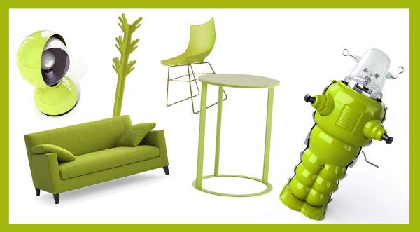
Given its positive values, Greenery brings freshness and balance. The balance, however, also depends on quantity, as it is important to avoid nauseating excesses or superfluous dissonances. Greenery is great for the living room or the children room, and its vital touch matches well with pastel tones, natural colours or dark shades. You can use the plain colour on single walls, or in a pattern for wallpaper. You can match it with ivory, sand or silver colours to create colour-contrasting doors. Greenery also looks great on furniture: even by itself, a Greenery sofa can create the mood of the living room. Alternately, you can choose it for details, from ornaments to Pantone cups, or make a natural choice: indoor plants.