
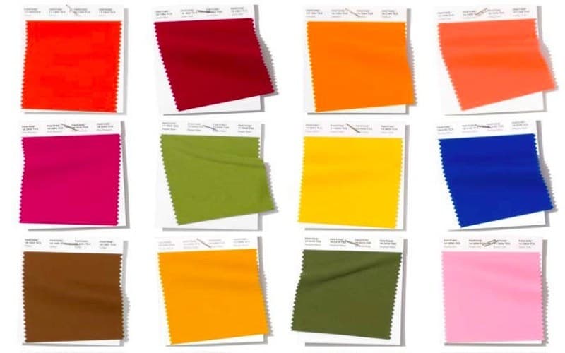
All the Pantone spring&summer 2019 colors in interior design.
Summer is a soulful season. Nature flourishes alongside your desire for a change and your ideas to renovate the environment you inhabit. What better inspiration than the spring&summer 2019 colors suggested by Pantone to enliven your home or office? Here are the trending colors and the best ideas to employ them in furnishing:
Energizing Coral.
Perfectly in line with sparkling marine atmospheres, coral holds a place of honor among the colors for spring&summer 2019. Pantone’s Living Coralis even the color of the year, chosen for its bright and delicate liveliness that paves the way for eleganceand sociability. But the warm Fiesta tonality is equally interesting, though more intense and showy. Thanks to its energizing quality, coral is perfect for decorating living rooms or for bedroom curtains and throw pillows. If you truly love this color, you might choose it for a single wall in the living room, a break in monotone white.
Introspective Blue.
Depth and balance are some of the main traits of the color blue. Two are the tonalities chosen for the spring&summer colors of 2019: Princess blue, bright and full of light, ideal for children’s rooms, your studio or a modern living room, possibly paired with lemon yellow; or the more intense Eclipse, a very classy tonality if combined with woodor marble, perfect for decorations, doors, or upholstered seats. Choose this color if you want to play with contrasts, say between floors and furniture, or walls and flush-to-the-wall doors painted in contrasting colors.
Peaceful Green.
Forget Greenery, the color of the year 2017, and the various shades of acid green. The trending greens for 2019 are far more sophisticated tonalities. Refined Terrarium Moss, an opaque sage nuance, goes hand in hand with warm wood hues, with leather, or even with smoke or milky white. The lighter Pepper Stem is perfect with dove grey, gold, or purple. Choose green for rugs, varnished wood furniture, or walls. A tranquilizing result is ensured.
Seductive Pink.
Cool shades of pink conquer spring&summer 2019 with two equally intriguing variants. The first is the delicate Sweet Liliac, pale and airy, perfect for walls, seats, and covers. A discrete and romantic tonality that is perfectly suited to even the most classic furnishings. The second, Pink Peacock, is a more demanding shade of fuchsia, perfect for small touches of color combined with white or ivory, or to enliven neutral environments.
A Yellow Beam of Light.
The color of the Sun is a must in the pleasant season, and in fact here it is, shining out among the colors for spring&summer 2019 in three marvelous shades. The most energizing is, without a doubt, Aspen Gold, a bright blond hue that can be paired with orange and blue for an illuminating effect. For those who prefer warmer hues, orange tinted Mango Mojito and spicy Turmeric are ready to bring an exotic touch, a blend of seduction and vitality. Choose these for walls, doors, or decorations in the kitchen, the living room or the study. There is no such thing as too much cheer in your convivial spaces.
Elegant Brown.
Brown has returned, in the title role, to the world of furnishing. Now, even in the spring&summer season, thanks to the warm earthen hues that evoke belonging and familiarity. Toffee, with its caramel nuance, is an extremely effective color for furniture as well as for walls. You may choose to pair it with pale wood, smoke or ivory white, Terrarium Moss green, rust red or Burgundy.
The Irresistible Lightness of Neutral Hues.
It may be because of the refinement they seem to radiate, or because of the practical pairings they make possible, neutral hues never go out of fashion. White, grey, sand, and creamare among the most recommended of spring&summer 2019 colors for those who love the quiet and purity of a minimal environment. Aside from their refreshing and relaxing effect, neutral hues can be combined with all the aforementioned colors. All you have to do is set your fantasy free and let yourself be guided by inspiration.